pacman::p_load(sf, spdep, tmap, tidyverse)Global and Local Measures of Spatial Autocorrelation
Analysis
R
sf
tmap
tidyverse
spatstat
spdep
knitr
6.1 Exercise Overview
In this hands-on exercise will teach you how to compute both Global and Local Measures of Spatial Autocorrelation (GMSA & LMSA) using the spdep package in R. By the end of the exercise, you will be able to:
Part 1: Global Measures of Spatial Autocorrelation (GMSA) Global Measures of Spatial Autocorrelation (GMSA) provide a single summary statistic describing the overall spatial structure in a dataset. Moran’s I is a commonly used statistic for GMSA. This part will guide you through computing and visualizing GMSA statistics.
Part 2: Local Measures of Spatial Autocorrelation (LMSA) Local Measures of Spatial Autocorrelation (LMSA) focus on the relationships between each observation and its surrounding areas. Unlike GMSA, LMSA provides detailed insights into local clusters and outliers. The most common LMSA statistic is Local Indicators of Spatial Association (LISA), along with Getis-Ord’s Gi-statistics for hot and cold spot analysis.
6.2 Data Acquisition
Two data sets will be used in this hands-on exercise, they are:
- Hunan county boundary layer. This is a geospatial data set in ESRI shapefile format.
- Hunan_2012.csv: This csv file contains selected Hunan’s local development indicators in 2012.
6.3 Getting Started
For this exercise, we will use the following 5 R packages:
sf, a relatively new R package specially designed to import, manage and process vector-based geospatial data in R.
spdep, an R package focused on spatial dependence and spatial econometrics. It includes functions for computing spatial weights, neighborhood structures, and spatially lagged variables, which are crucial for understanding spatial relationships in data.
tmap, a package for creating high-quality static and interactive maps, leveraging the Leaflet API for interactive visualizations.
tidyverse, a collection of R packages designed for data science. It includes packages like
dplyrfor data manipulation,ggplot2for data visualization, andtidyrfor data tidying, all of which are essential for handling and analyzing data efficiently in a clean and consistent manner.
To install and load these packages into the R environment, we use the p_load function from the pacman package:
6.4 Importing Data into R
In this section, you will learn how to bring a geospatial data and its associated attribute table into R environment. The geospatial data is in ESRI shapefile format and the attribute table is in csv format.
6.4.1 Import shapefile into r environment
The code chunk below uses st_read() of sf package to import Hunan shapefile into R. The imported shapefile will be simple features Object of sf.
hunan <- st_read(dsn = "data/Hands-on_Ex05/geospatial",
                 layer = "Hunan")
Reading layer `Hunan' from data source
`C:\Users\blzll\OneDrive\Desktop\Y3S1\IS415\Quarto\IS415\Hands-on_Ex\data\Hands-on_Ex05\geospatial'
using driver `ESRI Shapefile'
Simple feature collection with 88 features and 7 fields
Geometry type: POLYGON
Dimension: XY
Bounding box: xmin: 108.7831 ymin: 24.6342 xmax: 114.2544 ymax: 30.12812
Geodetic CRS: WGS 846.4.2 Import csv file into r environment
Next, we will import Hunan_2012.csv into R by using read_csv() of readr package. The output is R dataframe class.
hunan2012 <- read_csv("data/Hands-on_Ex05/aspatial/Hunan_2012.csv")
hunan2012
# A tibble: 88 × 29
County City avg_wage deposite FAI Gov_Rev Gov_Exp GDP GDPPC GIO
<chr> <chr> <dbl> <dbl> <dbl> <dbl> <dbl> <dbl> <dbl> <dbl>
1 Anhua Yiyang 30544 10967 6832. 457. 2703 13225 14567 9277.
2 Anren Chenz… 28058 4599. 6386. 221. 1455. 4941. 12761 4189.
3 Anxiang Chang… 31935 5517. 3541 244. 1780. 12482 23667 5109.
4 Baojing Hunan… 30843 2250 1005. 193. 1379. 4088. 14563 3624.
5 Chaling Zhuzh… 31251 8241. 6508. 620. 1947 11585 20078 9158.
6 Changning Hengy… 28518 10860 7920 770. 2632. 19886 24418 37392
7 Changsha Chang… 54540 24332 33624 5350 7886. 88009 88656 51361
8 Chengbu Shaoy… 28597 2581. 1922. 161. 1192. 2570. 10132 1681.
9 Chenxi Huaih… 33580 4990 5818. 460. 1724. 7755. 17026 6644.
10 Cili Zhang… 33099 8117. 4498. 500. 2306. 11378 18714 5843.
# ℹ 78 more rows
# ℹ 19 more variables: Loan <dbl>, NIPCR <dbl>, Bed <dbl>, Emp <dbl>,
# EmpR <dbl>, EmpRT <dbl>, Pri_Stu <dbl>, Sec_Stu <dbl>, Household <dbl>,
# Household_R <dbl>, NOIP <dbl>, Pop_R <dbl>, RSCG <dbl>, Pop_T <dbl>,
# Agri <dbl>, Service <dbl>, Disp_Inc <dbl>, RORP <dbl>, ROREmp <dbl>6.4.3 Performing relational join
The code chunk below will be used to update the attribute table of hunan’s SpatialPolygonsDataFrame with the attribute fields of hunan2012 data frame. This is performed by using left_join() of dplyr package.
hunan <- left_join(hunan,hunan2012, join_by(County))%>%
  select(1:4, 7, 15)
6.5 Visualising Regional Development Indicator
equal <- tm_shape(hunan) +
  tm_fill("GDPPC",
          n = 5,
          style = "equal",
          palette = "viridis") +
  tm_borders(alpha = 0.5) +
  tm_layout(main.title = "Equal interval classification")

quantile <- tm_shape(hunan) +
  tm_fill("GDPPC",
          n = 5,
          style = "quantile",
          palette = "viridis") +
  tm_borders(alpha = 0.5) +
  tm_layout(main.title = "Equal quantile classification")

tmap_arrange(equal,
             quantile,
             asp=1,
             ncol=2)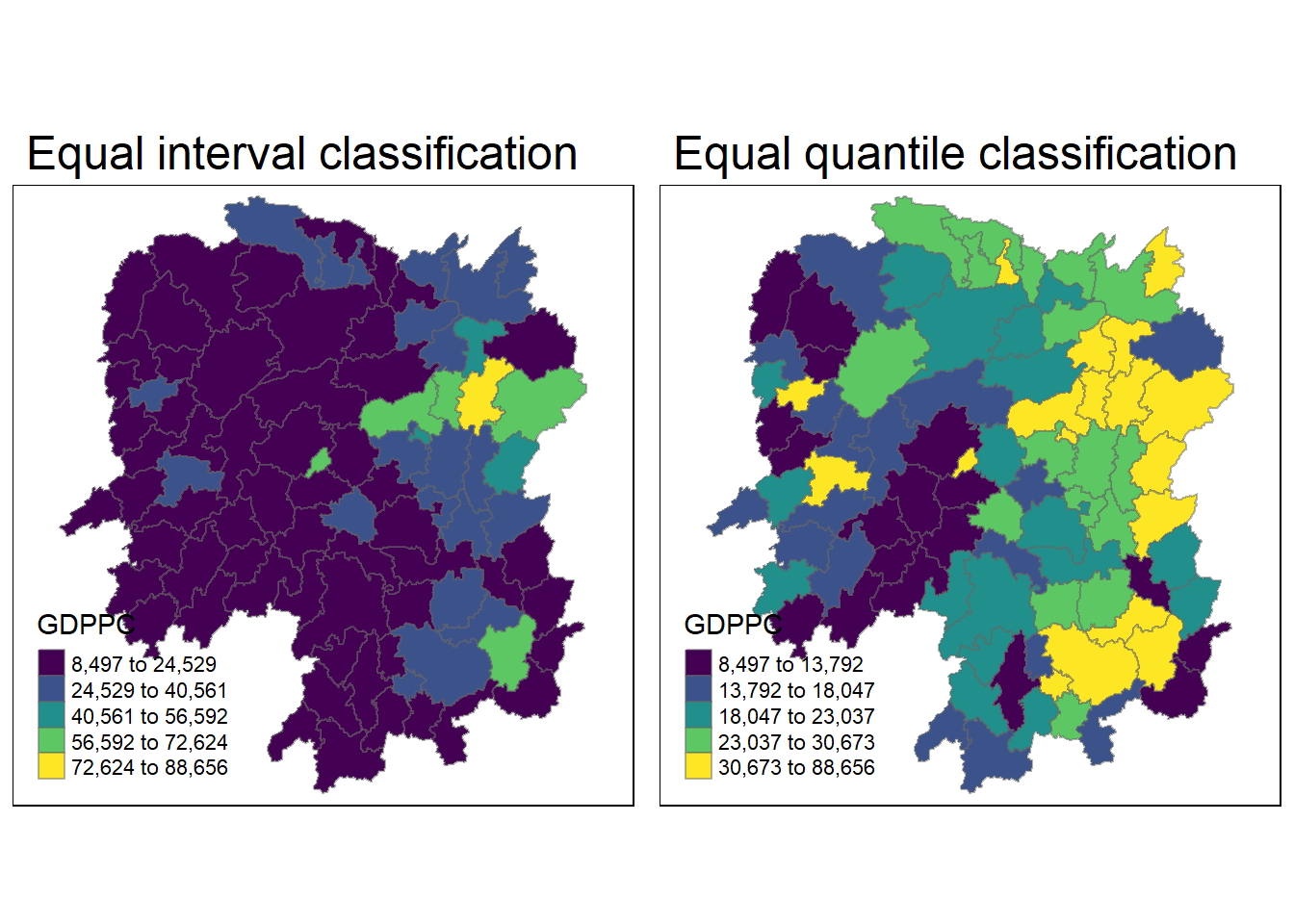
6.6 Global Measures of Spatial Autocorrelation
In this section, you will learn how to compute global spatial autocorrelation statistics and to perform spatial complete randomness test for global spatial autocorrelation.
6.6.1 Computing Contiguity Spatial Weights
Before we can compute the global spatial autocorrelation statistics, we need to construct a spatial weights of the study area. The spatial weights is used to define the neighbourhood relationships between the geographical units (i.e. county) in the study area.
In the code chunk below, poly2nb() of spdep package is used to compute contiguity weight matrices for the study area. This function builds a neighbours list based on regions with contiguous boundaries. If you look at the documentation you will see that you can pass a “queen” argument that takes TRUE or FALSE as options. If you do not specify this argument the default is set to TRUE, that is, if you don’t specify queen = FALSE this function will return a list of first order neighbours using the Queen criteria.
More specifically, the code chunk below is used to compute Queen contiguity weight matrix.
wm_q <- poly2nb(hunan,
                queen=TRUE)
summary(wm_q)
Neighbour list object:
Number of regions: 88
Number of nonzero links: 448
Percentage nonzero weights: 5.785124
Average number of links: 5.090909
Link number distribution:
1 2 3 4 5 6 7 8 9 11
2 2 12 16 24 14 11 4 2 1
2 least connected regions:
30 65 with 1 link
1 most connected region:
85 with 11 linksThe summary report above shows that there are 88 area units in Hunan. The most connected area unit has 11 neighbours. There are two area units with only one neighbours.
6.6.2 Row-standardised weights matrix
Next, we need to assign weights to each neighboring polygon. In our case, each neighboring polygon will be assigned equal weight (style=“W”). This is accomplished by assigning the fraction 1/(# of neighbors) to each neighboring county then summing the weighted income values. While this is the most intuitive way to summaries the neighbors’ values it has one drawback in that polygons along the edges of the study area will base their lagged values on fewer polygons thus potentially over- or under-estimating the true nature of the spatial autocorrelation in the data. For this example, we’ll stick with the style=“W” option for simplicity’s sake but note that other more robust options are available, notably style=“B”.
rswm_q <- nb2listw(wm_q,
                   style="W",
                   zero.policy = TRUE)
rswm_q
Characteristics of weights list object:
Neighbour list object:
Number of regions: 88
Number of nonzero links: 448
Percentage nonzero weights: 5.785124
Average number of links: 5.090909
Weights style: W
Weights constants summary:
n nn S0 S1 S2
W 88 7744 88 37.86334 365.9147
What can we learn from the code chunk above?
- The input of
nb2listw()must be an object of class nb. The syntax of the function has two major arguments, namely style and zero.poly. - style can take values “W”, “B”, “C”, “U”, “minmax” and “S”. B is the basic binary coding, W is row standardised (sums over all links to n), C is globally standardised (sums over all links to n), U is equal to C divided by the number of neighbours (sums over all links to unity), while S is the variance-stabilizing coding scheme proposed by Tiefelsdorf et al. 1999, p. 167-168 (sums over all links to n).
- If zero policy is set to TRUE, weights vectors of zero length are inserted for regions without neighbour in the neighbours list. These will in turn generate lag values of zero, equivalent to the sum of products of the zero row t(rep(0, length=length(neighbours))) %*% x, for arbitrary numerical vector x of length length(neighbours). The spatially lagged value of x for the zero-neighbour region will then be zero, which may (or may not) be a sensible choice.
6.7 Global Measures of Spatial Autocorrelation: Moran’s I
In this section, you will learn how to perform Moran’s I statistics testing by using moran.test() of spdep.
6.7.1 Maron’s I test
The code chunk below performs Moran’s I statistical testing using moran.test() of spdep.
moran.test(hunan$GDPPC,
           listw=rswm_q,
           zero.policy = TRUE,
           na.action=na.omit)
    Moran I test under randomisation

data:  hunan$GDPPC
weights: rswm_q

Moran I statistic standard deviate = 4.7351, p-value = 1.095e-06
alternative hypothesis: greater
sample estimates:
Moran I statistic       Expectation          Variance
      0.300749970      -0.011494253       0.004348351
Conclusion
Key Results: 1. Moran’s I statistic = 0.30075 2. Expectation = -0.01149 3. Variance = 0.00435 4. Moran I statistic standard deviate = 4.7351 5. p-value = 1.095e-06
The Moran’s I statistic = 0.30075 is positive, indicating positive spatial autocorrelation, meaning that regions with similar GDP per capita values are clustered together.
The p-value = 1.095e-06 is extremely small, meaning there is very strong evidence against the null hypothesis of no spatial autocorrelation. We can reject the null hypothesis and conclude that GDP per capita is spatially clustered across the regions in the Hunan dataset.
In summary, the Moran’s I test confirms the presence of statistically significant spatial clustering in GDP per capita in Hunan. Regions with high or low GDPPC tend to be near one another, rather than being randomly distributed.
6.7.2 Computing Monte Carlo Moran’s I
The code chunk below performs permutation test for Moran’s I statistic by using moran.mc() of spdep. A total of 1000 simulation will be performed.
set.seed(1234)
bperm= moran.mc(hunan$GDPPC,
                listw=rswm_q,
                nsim=999,
                zero.policy = TRUE,
                na.action=na.omit)
bperm
    Monte-Carlo simulation of Moran I

data:  hunan$GDPPC
weights: rswm_q
number of simulations + 1: 1000

statistic = 0.30075, observed rank = 1000, p-value = 0.001
alternative hypothesis: greater
Conclusion
Key Results:
- Statistic (Moran’s I) = 0.30075
- Observed rank = 1000
- p-value = 0.001
The Moran’s I value of 0.30075 is positive, indicating positive spatial autocorrelation, meaning regions with similar levels of GDPPC tend to be near each other.
The p-value = 0.001 is highly significant, meaning there is less than a 0.1% chance that this level of spatial autocorrelation is due to random chance. Therefore, we reject the null hypothesis of no spatial autocorrelation and conclude that GDPPC is spatially clustered in the Hunan region.
In summary, there is statistically significant evidence of spatial clustering in GDP per capita across the regions in the Hunan dataset.
6.7.3 Visualising Monte Carlo Moran’s I
It is always a good practice for us the examine the simulated Moran’s I test statistics in greater detail. This can be achieved by plotting the distribution of the statistical values as a histogram by using the code chunk below.
In the code chunk below hist() and abline() of R Graphics are used.
mean(bperm$res[1:999])[1] -0.01504572var(bperm$res[1:999])[1] 0.004371574summary(bperm$res[1:999]) Min. 1st Qu. Median Mean 3rd Qu. Max.
-0.18339 -0.06168 -0.02125 -0.01505 0.02611 0.27593 hist(bperm$res,
freq=TRUE,
breaks=20,
xlab="Simulated Moran's I")
abline(v=0,
col="red") 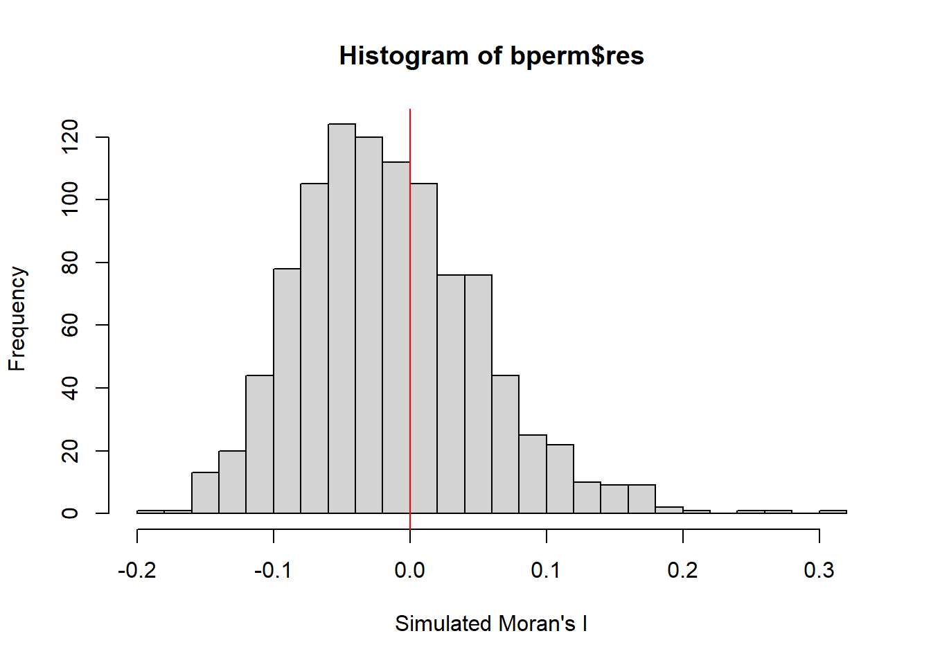
Observation
From the results provided, here’s what can be observed:
Mean of simulated Moran’s I: The mean of the simulated Moran’s I values (excluding the observed value) is -0.01505, which is close to 0. This suggests that under the null hypothesis (random distribution), Moran’s I is expected to be around 0, indicating no spatial autocorrelation.
Variance: The variance of the simulated Moran’s I values is 0.00437, which shows how much the simulated Moran’s I values spread around the mean.
Summary Statistics:
Minimum Moran’s I = -0.18339.
1st Quartile (25%) = -0.06168.
Median (50%) = -0.02125.
3rd Quartile (75%) = 0.02611.
Maximum Moran’s I = 0.27593.
Together with the histogram of the simulated Moran’s I values, this shows that most values are centered around 0, with a bell-shaped distribution, indicating that under random conditions, spatial autocorrelation is minimal or absent. However, the observed Moran’s I (red line in the histogram) is much larger than the bulk of the simulated values, which indicates significant positive spatial autocorrelation in the real data.
Using ggplot2 package to plot the values:
# Create a data frame for ggplot
simulated_data <- data.frame(simulated_morans_I = bperm$res)

# Plot using ggplot2
ggplot(simulated_data, aes(x = simulated_morans_I)) +
  geom_histogram(bins = 20, fill = "grey", color = "black") +  # Histogram with 20 bins
  geom_vline(xintercept = 0, color = "red", linetype = "solid") +  # Red line at 0
  labs(title = "Histogram of Simulated Moran's I",
       x = "Simulated Moran's I",
       y = "Frequency") +
  theme_minimal()  # Use a minimal theme for clean visuals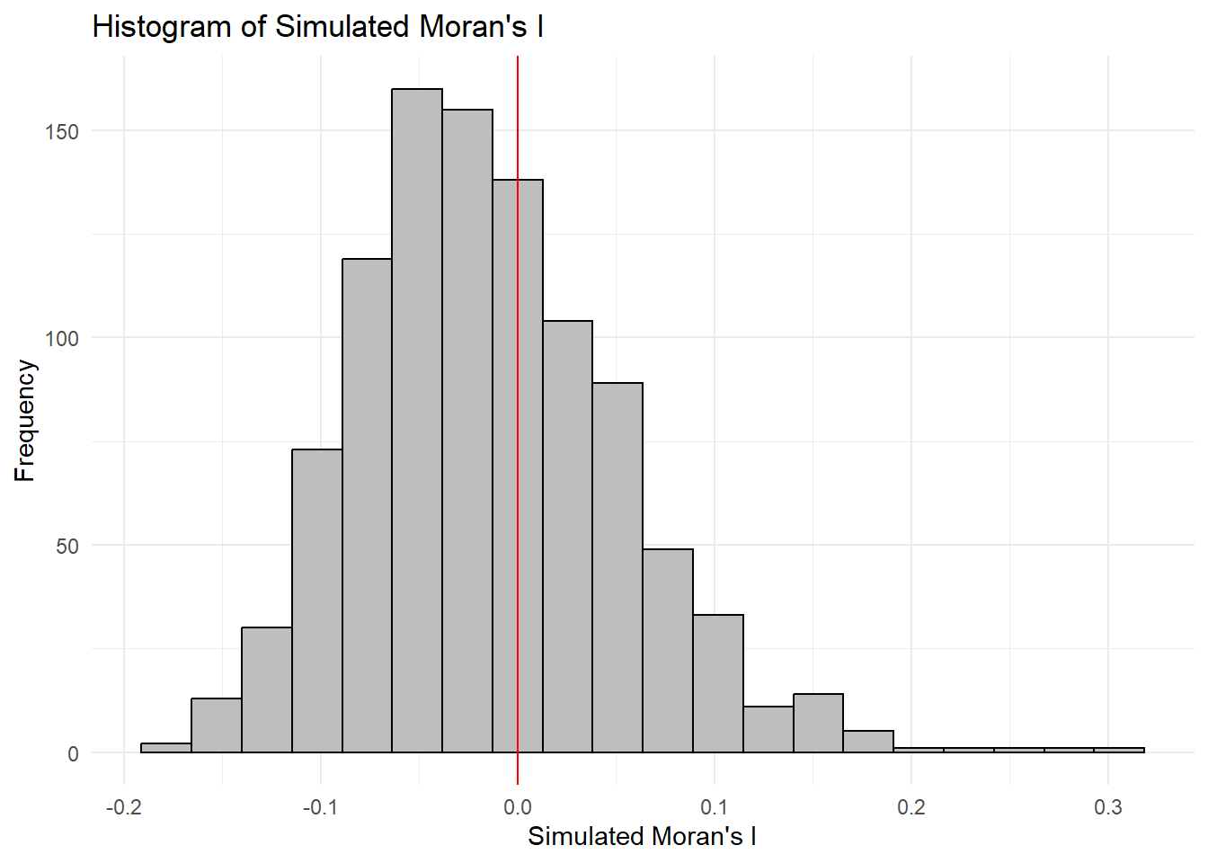
6.8 Global Measures of Spatial Autocorrelation: Geary’s C
In this section, you will learn how to perform Geary’s C statistics testing by using appropriate functions of spdep package.
6.8.1 Geary’s C test
The code chunk below performs Geary’s C test for spatial autocorrelation by using geary.test() of spdep.
geary.test(hunan$GDPPC, listw=rswm_q)
    Geary C test under randomisation

data:  hunan$GDPPC
weights: rswm_q

Geary C statistic standard deviate = 3.6108, p-value = 0.0001526
alternative hypothesis: Expectation greater than statistic
sample estimates:
Geary C statistic       Expectation          Variance
        0.6907223         1.0000000         0.0073364
Observation
Key Results:
Geary’s C statistic = 0.6907
Expectation = 1.0000
Variance = 0.0073364
Geary C statistic standard deviate = 3.6108
p-value = 0.0001526
The observed Geary’s C statistic of 0.6907 is significantly lower than the expected value of 1, indicating positive spatial autocorrelation. The p-value of 0.0001526 is very small, providing strong evidence to reject the null hypothesis of no spatial autocorrelation.
In conclusion, the Geary’s C test confirms that there is significant positive spatial autocorrelation in the GDP per capita values across the regions in Hunan. Similar GDPPC values tend to be clustered together spatially.
6.8.2 Computing Monte Carlo Geary’s C
The code chunk below performs permutation test for Geary’s C statistic by using geary.mc() of spdep.
set.seed(1234)
bperm=geary.mc(hunan$GDPPC,
               listw=rswm_q,
               nsim=999)
bperm
    Monte-Carlo simulation of Geary C

data:  hunan$GDPPC
weights: rswm_q
number of simulations + 1: 1000

statistic = 0.69072, observed rank = 1, p-value = 0.001
alternative hypothesis: greater
Observation
Statistic: The observed Geary’s C statistic is approximately 0.69072. Geary’s C is a measure of spatial autocorrelation, where values less than 1 indicate positive spatial autocorrelation (similar values clustered together).
Observed Rank: The observed rank is 1, which means that the observed statistic is the smallest among the 999 simulated values.
P-value: The p-value is 0.001, which is very low (typically, a threshold of 0.05 is used for significance). This suggests that the observed statistic is significantly lower than what would be expected under the null hypothesis of no spatial autocorrelation.
Given the low p-value, you can conclude that there is strong evidence against the null hypothesis, suggesting that there is significant positive spatial autocorrelation in the GDP per capita (GDPPC) data for Hunan. This implies that regions with similar GDPPC values tend to cluster together spatially.
6.8.3 Visualising the Monte Carlo Geary’s C
Next, we will plot a histogram to reveal the distribution of the simulated values by using the code chunk below.
mean(bperm$res[1:999])[1] 1.004402var(bperm$res[1:999])[1] 0.007436493summary(bperm$res[1:999]) Min. 1st Qu. Median Mean 3rd Qu. Max.
0.7142 0.9502 1.0052 1.0044 1.0595 1.2722 hist(bperm$res, freq=TRUE, breaks=20, xlab="Simulated Geary c")
abline(v=1, col="red") 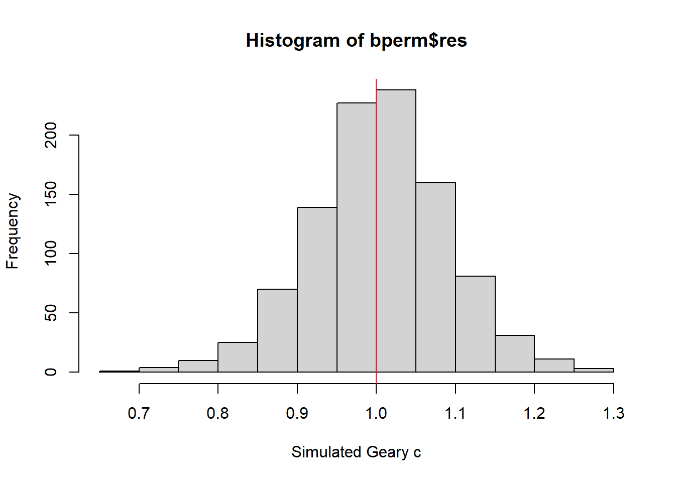
Observation
Key Results:
Minimum: 0.7142
1st Quartile (Q1): 0.9502
Median: 1.0052
Mean: 1.0044
3rd Quartile (Q3): 1.0595
Maximum: 1.2722
The median value being very close to the mean suggests a symmetric distribution of the simulated Geary’s C values, which is further confirmed by the range of values (from 0.7142 to 1.2722).
Histogram: The histogram with the red vertical line at 1 visually illustrates the distribution of the simulated values. Most of the values appear to be above 1, reinforcing the observation of a tendency for dissimilar values to be spatially distributed.
Overall, these statistics suggest that while the observed Geary’s C statistic (0.69072) indicates significant positive spatial autocorrelation, the simulated values are generally above 1, which points to dissimilar values being more likely to be near each other in space. This contrast emphasizes the clustering of similar GDPPC values in Hunan and indicates that the observed statistic is an extreme outcome under the null hypothesis of no spatial autocorrelation.
6.9 Spatial Correlogram
Spatial correlograms are great to examine patterns of spatial autocorrelation in your data or model residuals. They show how correlated are pairs of spatial observations when you increase the distance (lag) between them - they are plots of some index of autocorrelation (Moran’s I or Geary’s c) against distance.Although correlograms are not as fundamental as variograms (a keystone concept of geostatistics), they are very useful as an exploratory and descriptive tool. For this purpose they actually provide richer information than variograms.
6.9.1 Compute Moran’s I correlogram
In the code chunk below, sp.correlogram() of spdep package is used to compute a 6-lag spatial correlogram of GDPPC. The global spatial autocorrelation used in Moran’s I. The plot() of base Graph is then used to plot the output.
MI_corr <- sp.correlogram(wm_q,
                          hunan$GDPPC,
                          order=6,
                          method="I",
                          style="W")
plot(MI_corr)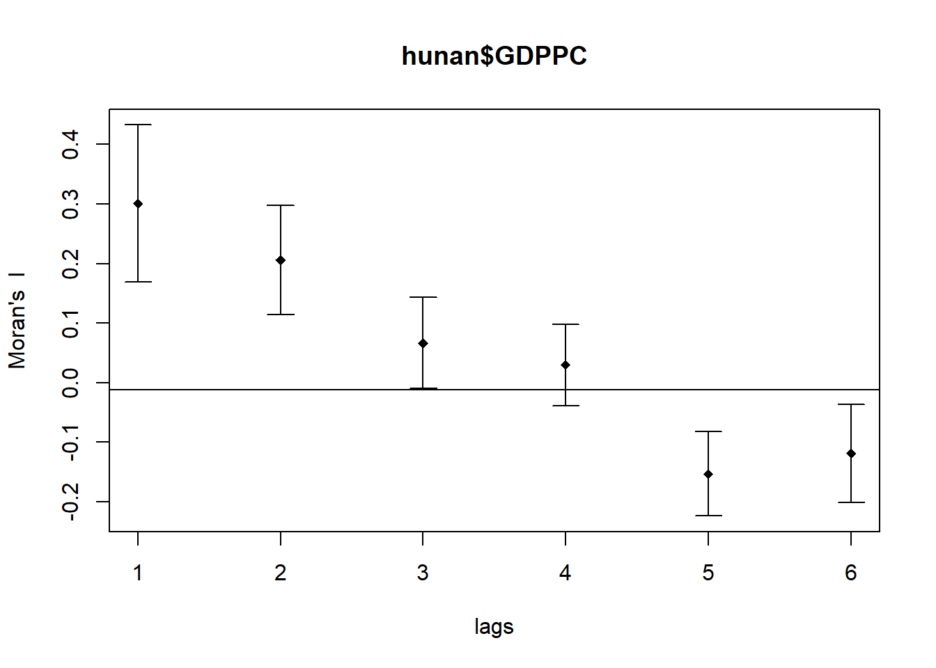
By plotting the output might not allow us to provide complete interpretation. This is because not all autocorrelation values are statistically significant. Hence, it is important for us to examine the full analysis report by printing out the analysis results as in the code chunk below.
print(MI_corr)Spatial correlogram for hunan$GDPPC
method: Moran's I
estimate expectation variance standard deviate Pr(I) two sided
1 (88) 0.3007500 -0.0114943 0.0043484 4.7351 2.189e-06 ***
2 (88) 0.2060084 -0.0114943 0.0020962 4.7505 2.029e-06 ***
3 (88) 0.0668273 -0.0114943 0.0014602 2.0496 0.040400 *
4 (88) 0.0299470 -0.0114943 0.0011717 1.2107 0.226015
5 (88) -0.1530471 -0.0114943 0.0012440 -4.0134 5.984e-05 ***
6 (88) -0.1187070 -0.0114943 0.0016791 -2.6164 0.008886 **
---
Signif. codes: 0 '***' 0.001 '**' 0.01 '*' 0.05 '.' 0.1 ' ' 1
Observation
There is strong positive spatial autocorrelation for lower lags (1, 2, and 3), suggesting that regions with similar GDPPC are spatially clustered. As the lag increases, this autocorrelation weakens and eventually becomes negative, indicating that regions with dissimilar GDPPC are more likely to be neighbors at larger spatial lags (5 and 6).
6.9.1 Compute Geary’s C correlogram and plot
In the code chunk below, sp.correlogram() of spdep package is used to compute a 6-lag spatial correlogram of GDPPC. The global spatial autocorrelation used in Geary’s C. The plot() of base Graph is then used to plot the output.
GC_corr <- sp.correlogram(wm_q,
                          hunan$GDPPC,
                          order=6,
                          method="C",
                          style="W")
plot(GC_corr)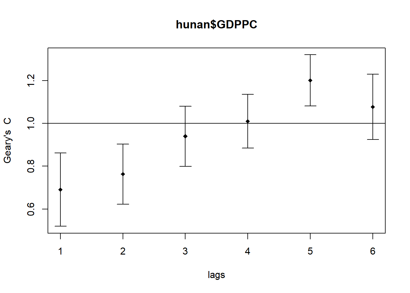
Similar to the previous step, we will print out the analysis report by using the code chunk below.
print(GC_corr)Spatial correlogram for hunan$GDPPC
method: Geary's C
estimate expectation variance standard deviate Pr(I) two sided
1 (88) 0.6907223 1.0000000 0.0073364 -3.6108 0.0003052 ***
2 (88) 0.7630197 1.0000000 0.0049126 -3.3811 0.0007220 ***
3 (88) 0.9397299 1.0000000 0.0049005 -0.8610 0.3892612
4 (88) 1.0098462 1.0000000 0.0039631 0.1564 0.8757128
5 (88) 1.2008204 1.0000000 0.0035568 3.3673 0.0007592 ***
6 (88) 1.0773386 1.0000000 0.0058042 1.0151 0.3100407
---
Signif. codes: 0 '***' 0.001 '**' 0.01 '*' 0.05 '.' 0.1 ' ' 16.10 Local Indicators of Spatial Association(LISA)
Local Indicators of Spatial Association or LISA are statistics that evaluate the existence of clusters and/or outliers in the spatial arrangement of a given variable. For instance if we are studying distribution of GDP per capita of Hunan Provice, People Republic of China, local clusters in GDP per capita mean that there are counties that have higher or lower rates than is to be expected by chance alone; that is, the values occurring are above or below those of a random distribution in space.
In this section, you will learn how to apply appropriate Local Indicators for Spatial Association (LISA), especially local Moran’I to detect cluster and/or outlier from GDP per capita 2012 of Hunan Province, PRC.
6.10.1 Computing local Moran’s I
To compute local Moran’s I, the localmoran() function of spdep will be used. It computes Ii values, given a set of zi values and a listw object providing neighbour weighting information for the polygon associated with the zi values.
The code chunks below are used to compute local Moran’s I of GDPPC2012 at the county level.
fips <- order(hunan$County)
localMI <- localmoran(hunan$GDPPC, rswm_q)
head(localMI)
Ii E.Ii Var.Ii Z.Ii Pr(z != E(Ii))
1 -0.001468468 -2.815006e-05 4.723841e-04 -0.06626904 0.9471636
2 0.025878173 -6.061953e-04 1.016664e-02 0.26266425 0.7928094
3 -0.011987646 -5.366648e-03 1.133362e-01 -0.01966705 0.9843090
4 0.001022468 -2.404783e-07 5.105969e-06 0.45259801 0.6508382
5 0.014814881 -6.829362e-05 1.449949e-03 0.39085814 0.6959021
6 -0.038793829 -3.860263e-04 6.475559e-03 -0.47728835 0.6331568localmoran() function returns a matrix of values whose columns are:
- Ii: the local Moran’s I statistics
- E.Ii: the expectation of local moran statistic under the randomisation hypothesis
- Var.Ii: the variance of local moran statistic under the randomisation hypothesis
- Z.Ii:the standard deviate of local moran statistic
- Pr(): the p-value of local moran statistic
6.10.1.1 Mapping the local Moran’s I
Before mapping the local Moran’s I map, it is wise to append the local Moran’s I dataframe (i.e. localMI) onto hunan SpatialPolygonDataFrame. The code chunks below can be used to perform the task. The out SpatialPolygonDataFrame is called hunan.localMI.
hunan.localMI <- cbind(hunan,localMI) %>%
  rename(Pr.Ii = Pr.z....E.Ii..)
6.10.1.2 Mapping local Moran’s I values
Using choropleth mapping functions of tmap package, we can plot the local Moran’s I values by using the code chinks below.
tm_shape(hunan.localMI) +
  tm_fill(col = "Ii",
          style = "pretty",
          palette = "RdBu",
          title = "local moran statistics") +
  tm_borders(alpha = 0.5)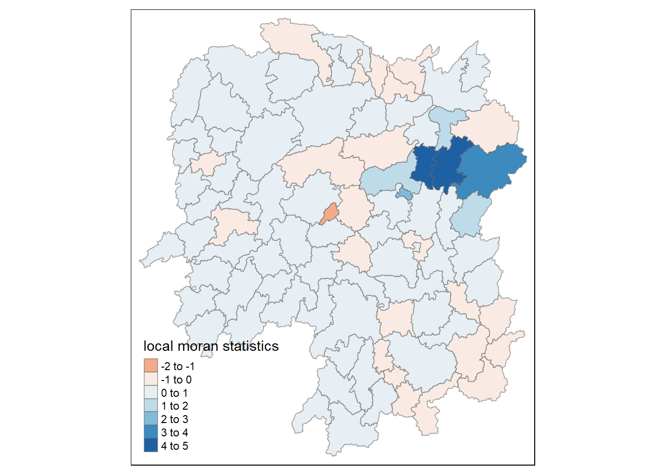
6.10.1.3 Mapping local Moran’s I p-values
The choropleth shows there is evidence for both positive and negative Ii values. However, it is useful to consider the p-values for each of these values, as consider above.
The code chunks below produce a choropleth map of Moran’s I p-values by using functions of tmap package.
tm_shape(hunan.localMI) +
  tm_fill(col = "Pr.Ii",
          breaks=c(-Inf, 0.001, 0.01, 0.05, 0.1, Inf),
          palette="-Blues",
          title = "local Moran's I p-values") +
  tm_borders(alpha = 0.5)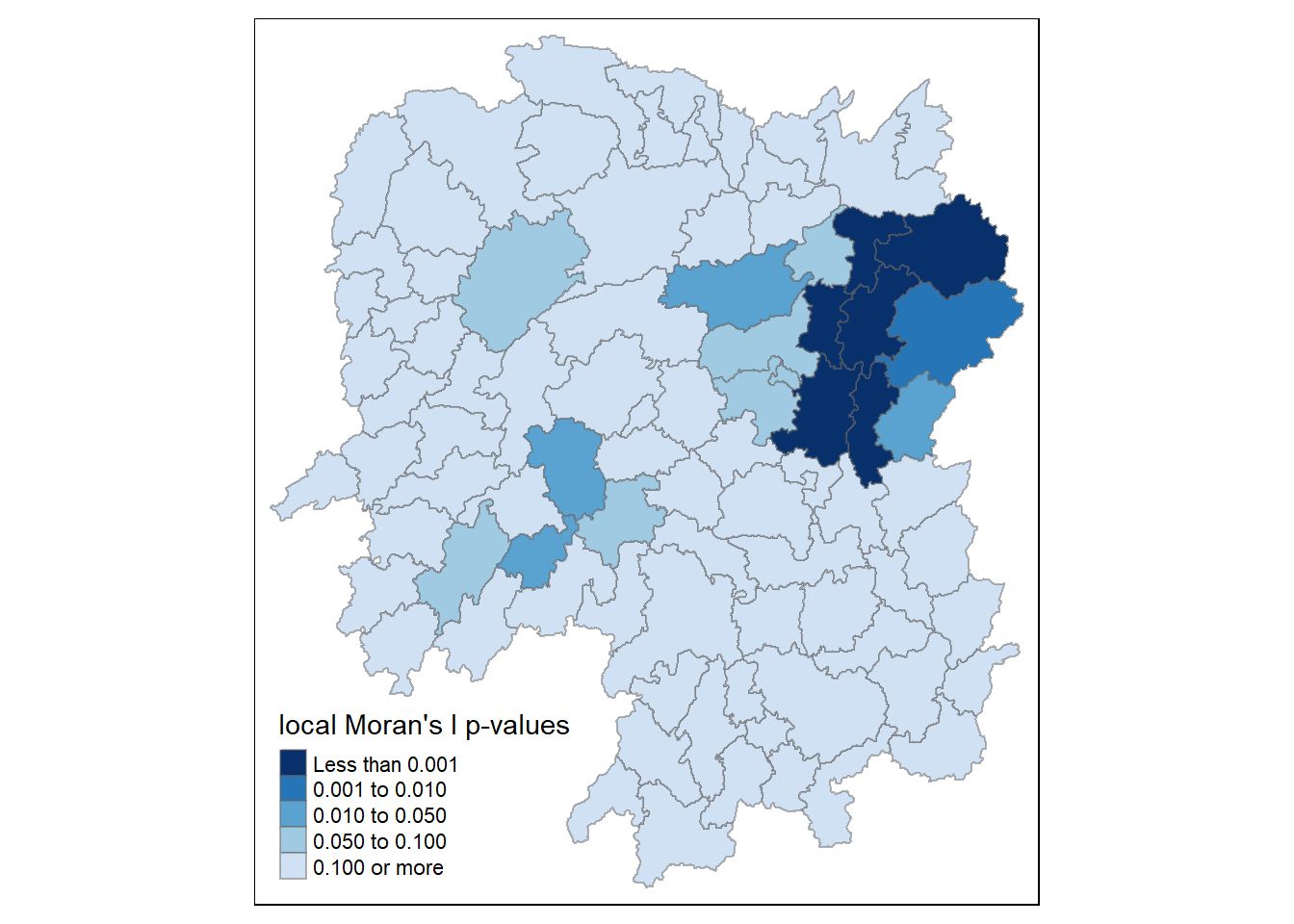
6.10.4 Mapping both local Moran’s I values and p-values
For effective interpretation, it is better to plot both the local Moran’s I values map and its corresponding p-values map next to each other.
The code chunk below will be used to create such visualisation.
localMI.map <- tm_shape(hunan.localMI) +
  tm_fill(col = "Ii",
          style = "pretty",
          title = "local moran statistics") +
  tm_borders(alpha = 0.5)

pvalue.map <- tm_shape(hunan.localMI) +
  tm_fill(col = "Pr.Ii",
          breaks=c(-Inf, 0.001, 0.01, 0.05, 0.1, Inf),
          palette="-Blues",
          title = "local Moran's I p-values") +
  tm_borders(alpha = 0.5)

tmap_arrange(localMI.map, pvalue.map, asp=1, ncol=2)
6.11 Creating a LISA Cluster Map
The LISA Cluster Map shows the significant locations color coded by type of spatial autocorrelation. The first step before we can generate the LISA cluster map is to plot the Moran scatterplot.
6.11.1 Plotting Moran scatterplot
The Moran scatterplot is an illustration of the relationship between the values of the chosen attribute at each location and the average value of the same attribute at neighboring locations.
The code chunk below plots the Moran scatterplot of GDPPC 2012 by using moran.plot() of spdep.
nci <- moran.plot(hunan$GDPPC, rswm_q,
                  labels=as.character(hunan$County),
                  xlab="GDPPC 2012",
                  ylab="Spatially Lag GDPPC 2012")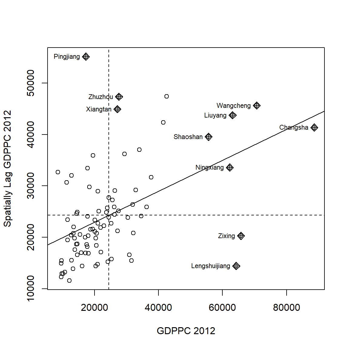
Notice that the plot is split in 4 quadrants. The top right corner belongs to areas that have high GDPPC and are surrounded by other areas that have the average level of GDPPC. This are the high-high locations in the lesson slide.
6.11.2 Plotting Moran scatterplot with standardised variable
First we will use scale() to centers and scales the variable. Here centering is done by subtracting the mean (omitting NAs) the corresponding columns, and scaling is done by dividing the (centered) variable by their standard deviations.
hunan$Z.GDPPC <- scale(hunan$GDPPC) %>%
  as.vector
The as.vector() added to the end is to make sure that the data type we get out of this is a vector, that map neatly into out dataframe.
Now, we are ready to plot the Moran scatterplot again by using the code chunk below.
nci2 <- moran.plot(hunan$Z.GDPPC, rswm_q,
                   labels=as.character(hunan$County),
                   xlab="z-GDPPC 2012",
                   ylab="Spatially Lag z-GDPPC 2012")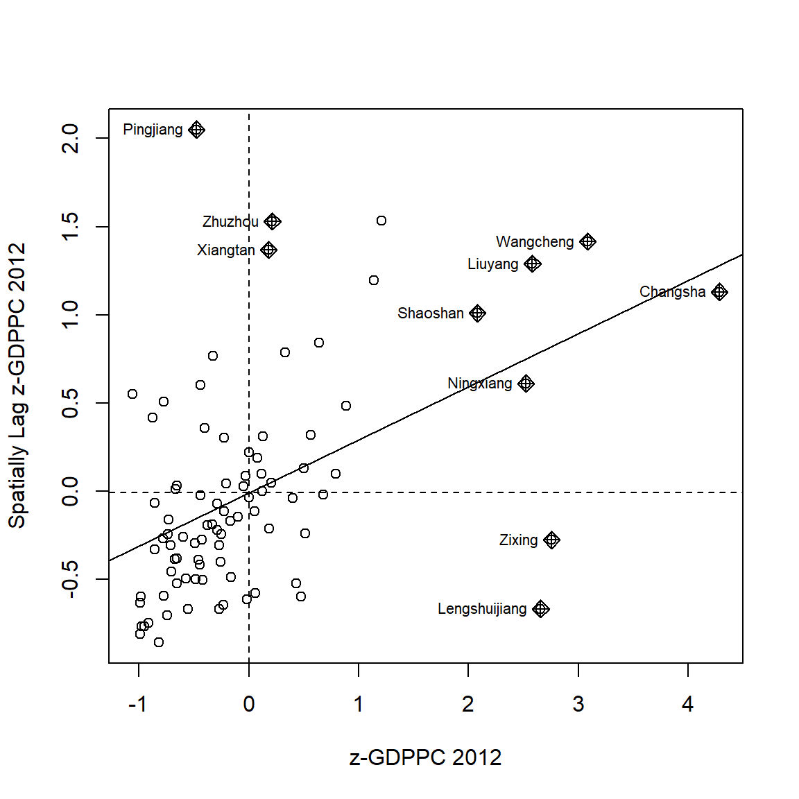
6.11.3 Preparing LISA map classes
The code chunks below show the steps to prepare a LISA cluster map.
quadrant <- vector(mode="numeric",length=nrow(localMI))Next, derives the spatially lagged variable of interest (i.e. GDPPC) and centers the spatially lagged variable around its mean.
hunan$lag_GDPPC <- lag.listw(rswm_q, hunan$GDPPC)
DV <- hunan$lag_GDPPC - mean(hunan$lag_GDPPC)
This is follow by centering the local Moran’s around the mean.
LM_I <- localMI[,1] - mean(localMI[,1]) Next, we will set a statistical significance level for the local Moran.
signif <- 0.05 These four command lines define the low-low (1), low-high (2), high-low (3) and high-high (4) categories.
quadrant[DV <0 & LM_I>0] <- 1
quadrant[DV >0 & LM_I<0] <- 2
quadrant[DV <0 & LM_I<0] <- 3
quadrant[DV >0 & LM_I>0] <- 4
Lastly, places non-significant Moran in the category 0.
quadrant[localMI[,5]>signif] <- 0In fact, we can combined all the steps into one single code chunk as shown below:
quadrant <- vector(mode="numeric",length=nrow(localMI))
hunan$lag_GDPPC <- lag.listw(rswm_q, hunan$GDPPC)
DV <- hunan$lag_GDPPC - mean(hunan$lag_GDPPC)
LM_I <- localMI[,1]
signif <- 0.05
quadrant[DV <0 & LM_I>0] <- 1
quadrant[DV >0 & LM_I<0] <- 2
quadrant[DV <0 & LM_I<0] <- 3
quadrant[DV >0 & LM_I>0] <- 4
quadrant[localMI[,5]>signif] <- 0
6.11.4 Plotting LISA map
Now, we can build the LISA map by using the code chunks below.
hunan.localMI$quadrant <- quadrant
colors <- c("#ffffff", "#2c7bb6", "#abd9e9", "#fdae61", "#d7191c")
clusters <- c("insignificant", "low-low", "low-high", "high-low", "high-high")

tm_shape(hunan.localMI) +
  tm_fill(col = "quadrant",
          style = "cat",
          palette = colors[c(sort(unique(quadrant)))+1],
          labels = clusters[c(sort(unique(quadrant)))+1],
          popup.vars = c("")) +
  tm_view(set.zoom.limits = c(11,17)) +
  tm_borders(alpha=0.5)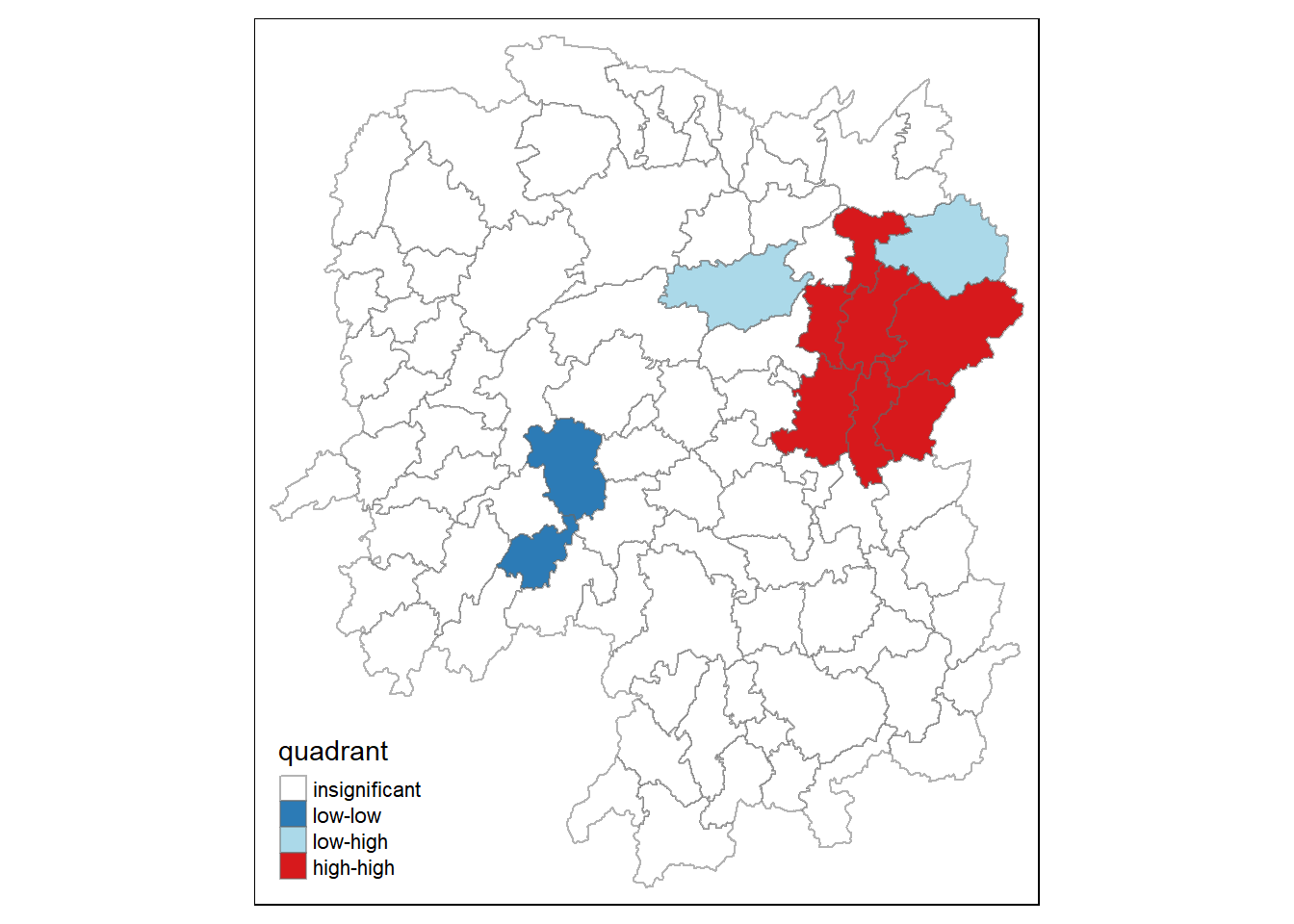
For effective interpretation, it is better to plot both the local Moran’s I values map and its corresponding p-values map next to each other.
The code chunk below will be used to create such visualisation.
gdppc <- qtm(hunan, "GDPPC")

hunan.localMI$quadrant <- quadrant
colors <- c("#ffffff", "#2c7bb6", "#abd9e9", "#fdae61", "#d7191c")
clusters <- c("insignificant", "low-low", "low-high", "high-low", "high-high")

LISAmap <- tm_shape(hunan.localMI) +
  tm_fill(col = "quadrant",
          style = "cat",
          palette = colors[c(sort(unique(quadrant)))+1],
          labels = clusters[c(sort(unique(quadrant)))+1],
          popup.vars = c("")) +
  tm_view(set.zoom.limits = c(11,17)) +
  tm_borders(alpha=0.5)

tmap_arrange(gdppc, LISAmap,
             asp=1, ncol=2)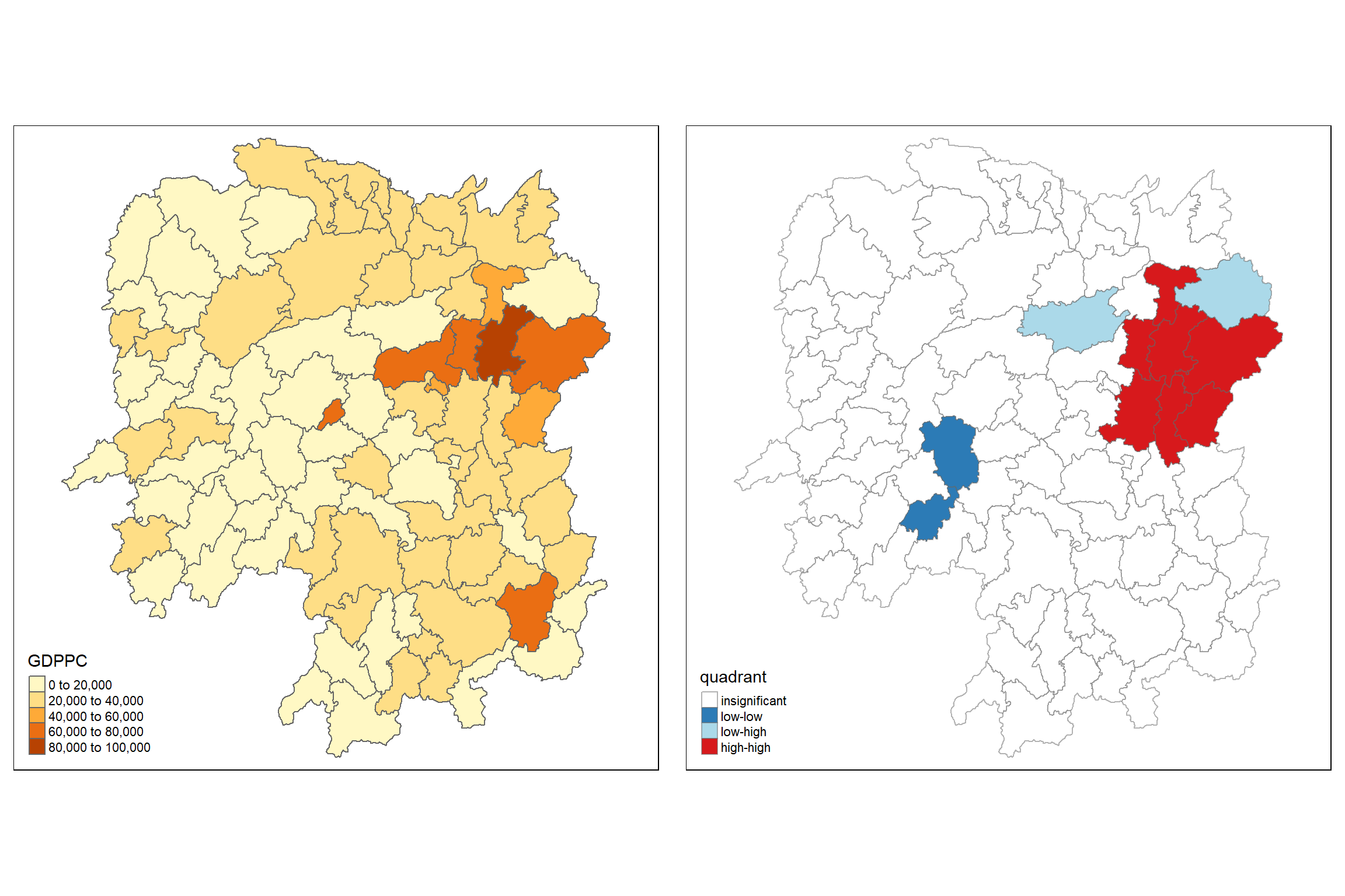
We can also include the local Moran’s I map and p-value map as shown below for easy comparison.
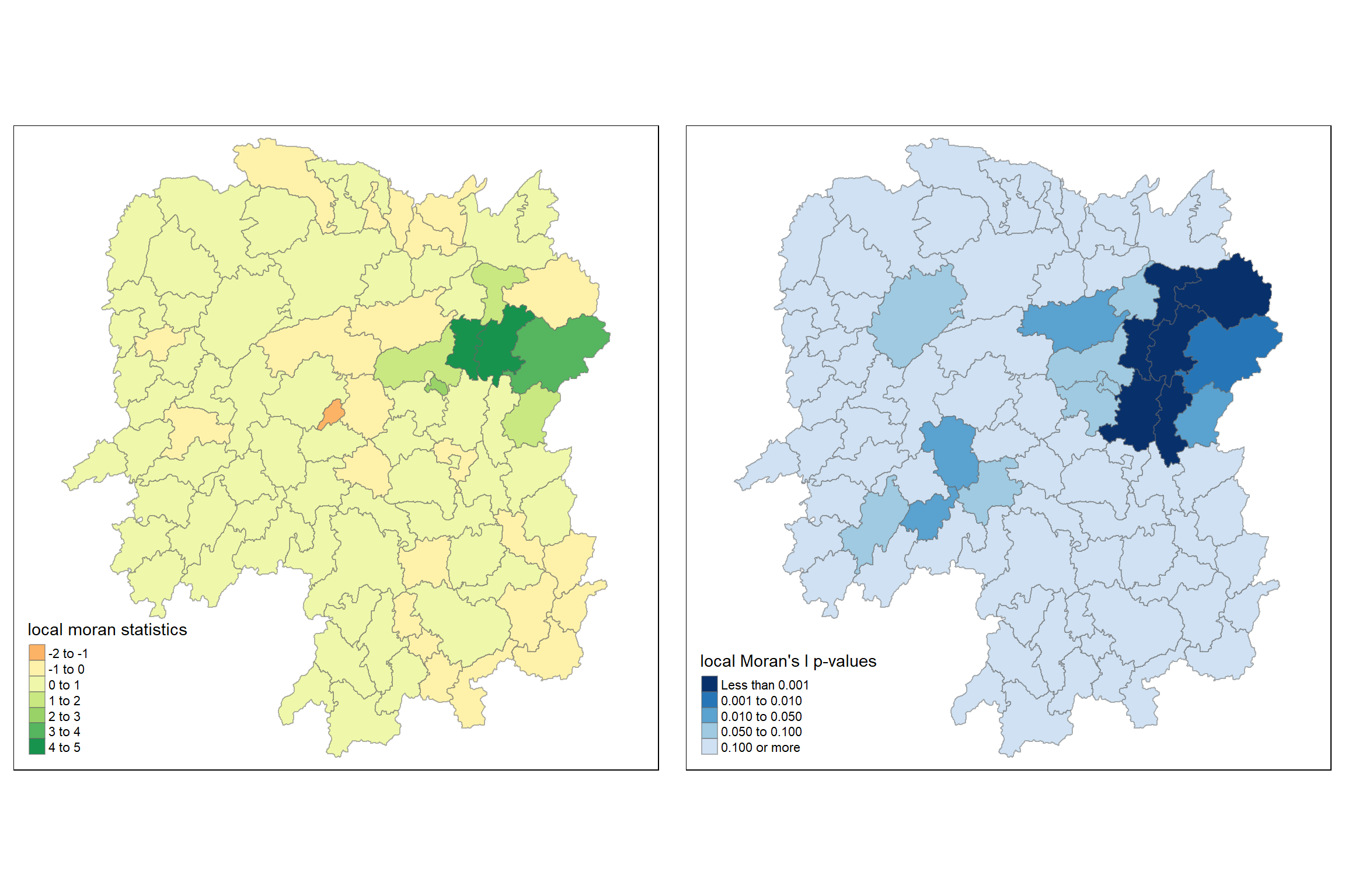
Observation
The Local Indicators of Spatial Association (LISA) map consists of two panels, each providing different information about local spatial autocorrelation for GDPPC in the Hunan region:
Left Panel: Local Moran’s I Statistics
Spatial Clustering:
The regions are colored based on the value of Local Moran’s I statistics. Areas with positive values indicate clustering of similar values (high-high or low-low), while negative values indicate spatial outliers (high-low or low-high).
Darker green areas show strong positive autocorrelation (high-high clustering), indicating that regions with high GDPPC are surrounded by other regions with high GDPPC.
The small orange region in the middle represents negative autocorrelation, indicating it is a spatial outlier with a lower GDPPC than its neighbors.
Spatial Outliers and Clusters:
Most of the regions are in the range of -1 to 1 (light yellow) indicating weak or no significant local spatial autocorrelation.
Darker green regions are where significant positive clustering is observed, suggesting economic similarity in terms of GDPPC within these clusters.
Right Panel: Local Moran’s I p-values
Significance of Spatial Autocorrelation:
This panel displays the significance of the local Moran’s I statistics. Darker blue colors represent regions with significant local spatial autocorrelation (lower p-values).
The areas with the darkest blue (p < 0.001) correspond to significant clusters of either high or low GDPPC. These regions are the same as those showing strong positive autocorrelation in the left panel (dark green areas).
Identification of Significant Clusters:
The map helps in identifying the most statistically significant clusters. The significant regions mostly match the dark green regions in the left panel, confirming that these clusters are not due to random spatial patterns but are statistically significant.
Areas with lighter shades of blue (higher p-values) indicate non-significant local Moran’s I values, implying no strong evidence for spatial autocorrelation in those regions.
6.12 Hot Spot and Cold Spot Area Analysis
Beside detecting cluster and outliers, localised spatial statistics can be also used to detect hot spot and/or cold spot areas.
The term ‘hot spot’ has been used generically across disciplines to describe a region or value that is higher relative to its surroundings (Lepers et al 2005, Aben et al 2012, Isobe et al 2015).
6.12.1 Getis and Ord’s G-Statistics
An alternative spatial statistics to detect spatial anomalies is the Getis and Ord’s G-statistics (Getis and Ord, 1972; Ord and Getis, 1995). It looks at neighbours within a defined proximity to identify where either high or low values clutser spatially. Here, statistically significant hot-spots are recognised as areas of high values where other areas within a neighbourhood range also share high values too.
The analysis consists of three steps:
- Deriving spatial weight matrix
- Computing Gi statistics
- Mapping Gi statistics
6.12.2 Deriving distance-based weight matrix
First, we need to define a new set of neighbours. Whist the spatial autocorrelation considered units which shared borders, for Getis-Ord we are defining neighbours based on distance.
There are two type of distance-based proximity matrix, they are:
- fixed distance weight matrix; and
- adaptive distance weight matrix.
6.12.2.1 Deriving the centroid
We will need points to associate with each polygon before we can make our connectivity graph. It will be a little more complicated than just running st_centroid() on the sf object: us.bound. We need the coordinates in a separate data frame for this to work. To do this we will use a mapping function. The mapping function applies a given function to each element of a vector and returns a vector of the same length. Our input vector will be the geometry column of us.bound. Our function will be st_centroid(). We will be using map_dbl variation of map from the purrr package. For more documentation, check out map documentation
To get our longitude values we map the st_centroid() function over the geometry column of us.bound and access the longitude value through double bracket notation [[]] and 1. This allows us to get only the longitude, which is the first value in each centroid.
longitude <- map_dbl(hunan$geometry, ~st_centroid(.x)[[1]])We do the same for latitude with one key difference. We access the second value per each centroid with [[2]].
latitude <- map_dbl(hunan$geometry, ~st_centroid(.x)[[2]])Now that we have latitude and longitude, we use cbind to put longitude and latitude into the same object.
coords <- cbind(longitude, latitude)6.12.2.2 Determine the cut-off distance
Firstly, we need to determine the upper limit for distance band by using the steps below:
- Return a matrix with the indices of points belonging to the set of the k nearest neighbours of each other by using knearneigh() of spdep.
- Convert the knn object returned by knearneigh() into a neighbours list of class nb with a list of integer vectors containing neighbour region number ids by using knn2nb().
- Return the length of neighbour relationship edges by using nbdists() of spdep. The function returns in the units of the coordinates if the coordinates are projected, in km otherwise.
- Remove the list structure of the returned object by using unlist().
#coords <- coordinates(hunan)
k1 <- knn2nb(knearneigh(coords))
k1dists <- unlist(nbdists(k1, coords, longlat = TRUE))
summary(k1dists)
Min. 1st Qu. Median Mean 3rd Qu. Max.
24.79 32.57 38.01 39.07 44.52 61.79 The summary report shows that the largest first nearest neighbour distance is 61.79 km, so using this as the upper threshold gives certainty that all units will have at least one neighbour.
6.12.2.3 Computing fixed distance weight matrix
Now, we will compute the distance weight matrix by using dnearneigh() as shown in the code chunk below.
wm_d62 <- dnearneigh(coords, 0, 62, longlat = TRUE)
wm_d62
Neighbour list object:
Number of regions: 88
Number of nonzero links: 324
Percentage nonzero weights: 4.183884
Average number of links: 3.681818 Next, nb2listw() is used to convert the nb object into spatial weights object.
wm62_lw <- nb2listw(wm_d62, style = 'B')
summary(wm62_lw)Characteristics of weights list object:
Neighbour list object:
Number of regions: 88
Number of nonzero links: 324
Percentage nonzero weights: 4.183884
Average number of links: 3.681818
Link number distribution:
1 2 3 4 5 6
6 15 14 26 20 7
6 least connected regions:
6 15 30 32 56 65 with 1 link
7 most connected regions:
21 28 35 45 50 52 82 with 6 links
Weights style: B
Weights constants summary:
n nn S0 S1 S2
B 88 7744 324 648 5440The output spatial weights object is called wm62_lw.
6.12.3 Computing adaptive distance weight matrix
One of the characteristics of fixed distance weight matrix is that more densely settled areas (usually the urban areas) tend to have more neighbours and the less densely settled areas (usually the rural counties) tend to have lesser neighbours. Having many neighbours smoothe the neighbour relationship across more neighbours.
It is possible to control the numbers of neighbours directly using k-nearest neighbours, either accepting asymmetric neighbours or imposing symmetry as shown in the code chunk below.
knn <- knn2nb(knearneigh(coords, k=8))
knn
Neighbour list object:
Number of regions: 88
Number of nonzero links: 704
Percentage nonzero weights: 9.090909
Average number of links: 8
Non-symmetric neighbours listNext, nb2listw() is used to convert the nb object into spatial weights object.
knn_lw <- nb2listw(knn, style = 'B')
summary(knn_lw)Characteristics of weights list object:
Neighbour list object:
Number of regions: 88
Number of nonzero links: 704
Percentage nonzero weights: 9.090909
Average number of links: 8
Non-symmetric neighbours list
Link number distribution:
8
88
88 least connected regions:
1 2 3 4 5 6 7 8 9 10 11 12 13 14 15 16 17 18 19 20 21 22 23 24 25 26 27 28 29 30 31 32 33 34 35 36 37 38 39 40 41 42 43 44 45 46 47 48 49 50 51 52 53 54 55 56 57 58 59 60 61 62 63 64 65 66 67 68 69 70 71 72 73 74 75 76 77 78 79 80 81 82 83 84 85 86 87 88 with 8 links
88 most connected regions:
1 2 3 4 5 6 7 8 9 10 11 12 13 14 15 16 17 18 19 20 21 22 23 24 25 26 27 28 29 30 31 32 33 34 35 36 37 38 39 40 41 42 43 44 45 46 47 48 49 50 51 52 53 54 55 56 57 58 59 60 61 62 63 64 65 66 67 68 69 70 71 72 73 74 75 76 77 78 79 80 81 82 83 84 85 86 87 88 with 8 links
Weights style: B
Weights constants summary:
n nn S0 S1 S2
B 88 7744 704 1300 230146.13 Computing Gi statistics
6.13.1 Gi statistics using fixed distance
fips <- order(hunan$County)
gi.fixed <- localG(hunan$GDPPC, wm62_lw)
gi.fixed
[1] 0.436075843 -0.265505650 -0.073033665 0.413017033 0.273070579
[6] -0.377510776 2.863898821 2.794350420 5.216125401 0.228236603
[11] 0.951035346 -0.536334231 0.176761556 1.195564020 -0.033020610
[16] 1.378081093 -0.585756761 -0.419680565 0.258805141 0.012056111
[21] -0.145716531 -0.027158687 -0.318615290 -0.748946051 -0.961700582
[26] -0.796851342 -1.033949773 -0.460979158 -0.885240161 -0.266671512
[31] -0.886168613 -0.855476971 -0.922143185 -1.162328599 0.735582222
[36] -0.003358489 -0.967459309 -1.259299080 -1.452256513 -1.540671121
[41] -1.395011407 -1.681505286 -1.314110709 -0.767944457 -0.192889342
[46] 2.720804542 1.809191360 -1.218469473 -0.511984469 -0.834546363
[51] -0.908179070 -1.541081516 -1.192199867 -1.075080164 -1.631075961
[56] -0.743472246 0.418842387 0.832943753 -0.710289083 -0.449718820
[61] -0.493238743 -1.083386776 0.042979051 0.008596093 0.136337469
[66] 2.203411744 2.690329952 4.453703219 -0.340842743 -0.129318589
[71] 0.737806634 -1.246912658 0.666667559 1.088613505 -0.985792573
[76] 1.233609606 -0.487196415 1.626174042 -1.060416797 0.425361422
[81] -0.837897118 -0.314565243 0.371456331 4.424392623 -0.109566928
[86] 1.364597995 -1.029658605 -0.718000620
attr(,"internals")
Gi E(Gi) V(Gi) Z(Gi) Pr(z != E(Gi))
[1,] 0.064192949 0.05747126 2.375922e-04 0.436075843 6.627817e-01
[2,] 0.042300020 0.04597701 1.917951e-04 -0.265505650 7.906200e-01
[3,] 0.044961480 0.04597701 1.933486e-04 -0.073033665 9.417793e-01
[4,] 0.039475779 0.03448276 1.461473e-04 0.413017033 6.795941e-01
[5,] 0.049767939 0.04597701 1.927263e-04 0.273070579 7.847990e-01
[6,] 0.008825335 0.01149425 4.998177e-05 -0.377510776 7.057941e-01
[7,] 0.050807266 0.02298851 9.435398e-05 2.863898821 4.184617e-03
[8,] 0.083966739 0.04597701 1.848292e-04 2.794350420 5.200409e-03
[9,] 0.115751554 0.04597701 1.789361e-04 5.216125401 1.827045e-07
[10,] 0.049115587 0.04597701 1.891013e-04 0.228236603 8.194623e-01
[11,] 0.045819180 0.03448276 1.420884e-04 0.951035346 3.415864e-01
[12,] 0.049183846 0.05747126 2.387633e-04 -0.536334231 5.917276e-01
[13,] 0.048429181 0.04597701 1.924532e-04 0.176761556 8.596957e-01
[14,] 0.034733752 0.02298851 9.651140e-05 1.195564020 2.318667e-01
[15,] 0.011262043 0.01149425 4.945294e-05 -0.033020610 9.736582e-01
[16,] 0.065131196 0.04597701 1.931870e-04 1.378081093 1.681783e-01
[17,] 0.027587075 0.03448276 1.385862e-04 -0.585756761 5.580390e-01
[18,] 0.029409313 0.03448276 1.461397e-04 -0.419680565 6.747188e-01
[19,] 0.061466754 0.05747126 2.383385e-04 0.258805141 7.957856e-01
[20,] 0.057656917 0.05747126 2.371303e-04 0.012056111 9.903808e-01
[21,] 0.066518379 0.06896552 2.820326e-04 -0.145716531 8.841452e-01
[22,] 0.045599896 0.04597701 1.928108e-04 -0.027158687 9.783332e-01
[23,] 0.030646753 0.03448276 1.449523e-04 -0.318615290 7.500183e-01
[24,] 0.035635552 0.04597701 1.906613e-04 -0.748946051 4.538897e-01
[25,] 0.032606647 0.04597701 1.932888e-04 -0.961700582 3.362000e-01
[26,] 0.035001352 0.04597701 1.897172e-04 -0.796851342 4.255374e-01
[27,] 0.012746354 0.02298851 9.812587e-05 -1.033949773 3.011596e-01
[28,] 0.061287917 0.06896552 2.773884e-04 -0.460979158 6.448136e-01
[29,] 0.014277403 0.02298851 9.683314e-05 -0.885240161 3.760271e-01
[30,] 0.009622875 0.01149425 4.924586e-05 -0.266671512 7.897221e-01
[31,] 0.014258398 0.02298851 9.705244e-05 -0.886168613 3.755267e-01
[32,] 0.005453443 0.01149425 4.986245e-05 -0.855476971 3.922871e-01
[33,] 0.043283712 0.05747126 2.367109e-04 -0.922143185 3.564539e-01
[34,] 0.020763514 0.03448276 1.393165e-04 -1.162328599 2.451020e-01
[35,] 0.081261843 0.06896552 2.794398e-04 0.735582222 4.619850e-01
[36,] 0.057419907 0.05747126 2.338437e-04 -0.003358489 9.973203e-01
[37,] 0.013497133 0.02298851 9.624821e-05 -0.967459309 3.333145e-01
[38,] 0.019289310 0.03448276 1.455643e-04 -1.259299080 2.079223e-01
[39,] 0.025996272 0.04597701 1.892938e-04 -1.452256513 1.464303e-01
[40,] 0.016092694 0.03448276 1.424776e-04 -1.540671121 1.233968e-01
[41,] 0.035952614 0.05747126 2.379439e-04 -1.395011407 1.630124e-01
[42,] 0.031690963 0.05747126 2.350604e-04 -1.681505286 9.266481e-02
[43,] 0.018750079 0.03448276 1.433314e-04 -1.314110709 1.888090e-01
[44,] 0.015449080 0.02298851 9.638666e-05 -0.767944457 4.425202e-01
[45,] 0.065760689 0.06896552 2.760533e-04 -0.192889342 8.470456e-01
[46,] 0.098966900 0.05747126 2.326002e-04 2.720804542 6.512325e-03
[47,] 0.085415780 0.05747126 2.385746e-04 1.809191360 7.042128e-02
[48,] 0.038816536 0.05747126 2.343951e-04 -1.218469473 2.230456e-01
[49,] 0.038931873 0.04597701 1.893501e-04 -0.511984469 6.086619e-01
[50,] 0.055098610 0.06896552 2.760948e-04 -0.834546363 4.039732e-01
[51,] 0.033405005 0.04597701 1.916312e-04 -0.908179070 3.637836e-01
[52,] 0.043040784 0.06896552 2.829941e-04 -1.541081516 1.232969e-01
[53,] 0.011297699 0.02298851 9.615920e-05 -1.192199867 2.331829e-01
[54,] 0.040968457 0.05747126 2.356318e-04 -1.075080164 2.823388e-01
[55,] 0.023629663 0.04597701 1.877170e-04 -1.631075961 1.028743e-01
[56,] 0.006281129 0.01149425 4.916619e-05 -0.743472246 4.571958e-01
[57,] 0.063918654 0.05747126 2.369553e-04 0.418842387 6.753313e-01
[58,] 0.070325003 0.05747126 2.381374e-04 0.832943753 4.048765e-01
[59,] 0.025947288 0.03448276 1.444058e-04 -0.710289083 4.775249e-01
[60,] 0.039752578 0.04597701 1.915656e-04 -0.449718820 6.529132e-01
[61,] 0.049934283 0.05747126 2.334965e-04 -0.493238743 6.218439e-01
[62,] 0.030964195 0.04597701 1.920248e-04 -1.083386776 2.786368e-01
[63,] 0.058129184 0.05747126 2.343319e-04 0.042979051 9.657182e-01
[64,] 0.046096514 0.04597701 1.932637e-04 0.008596093 9.931414e-01
[65,] 0.012459080 0.01149425 5.008051e-05 0.136337469 8.915545e-01
[66,] 0.091447733 0.05747126 2.377744e-04 2.203411744 2.756574e-02
[67,] 0.049575872 0.02298851 9.766513e-05 2.690329952 7.138140e-03
[68,] 0.107907212 0.04597701 1.933581e-04 4.453703219 8.440175e-06
[69,] 0.019616151 0.02298851 9.789454e-05 -0.340842743 7.332220e-01
[70,] 0.032923393 0.03448276 1.454032e-04 -0.129318589 8.971056e-01
[71,] 0.030317663 0.02298851 9.867859e-05 0.737806634 4.606320e-01
[72,] 0.019437582 0.03448276 1.455870e-04 -1.246912658 2.124295e-01
[73,] 0.055245460 0.04597701 1.932838e-04 0.666667559 5.049845e-01
[74,] 0.074278054 0.05747126 2.383538e-04 1.088613505 2.763244e-01
[75,] 0.013269580 0.02298851 9.719982e-05 -0.985792573 3.242349e-01
[76,] 0.049407829 0.03448276 1.463785e-04 1.233609606 2.173484e-01
[77,] 0.028605749 0.03448276 1.455139e-04 -0.487196415 6.261191e-01
[78,] 0.039087662 0.02298851 9.801040e-05 1.626174042 1.039126e-01
[79,] 0.031447120 0.04597701 1.877464e-04 -1.060416797 2.889550e-01
[80,] 0.064005294 0.05747126 2.359641e-04 0.425361422 6.705732e-01
[81,] 0.044606529 0.05747126 2.357330e-04 -0.837897118 4.020885e-01
[82,] 0.063700493 0.06896552 2.801427e-04 -0.314565243 7.530918e-01
[83,] 0.051142205 0.04597701 1.933560e-04 0.371456331 7.102977e-01
[84,] 0.102121112 0.04597701 1.610278e-04 4.424392623 9.671399e-06
[85,] 0.021901462 0.02298851 9.843172e-05 -0.109566928 9.127528e-01
[86,] 0.064931813 0.04597701 1.929430e-04 1.364597995 1.723794e-01
[87,] 0.031747344 0.04597701 1.909867e-04 -1.029658605 3.031703e-01
[88,] 0.015893319 0.02298851 9.765131e-05 -0.718000620 4.727569e-01
attr(,"cluster")
[1] Low Low High High High High High High High Low Low High Low Low Low
[16] High High High High Low High High Low Low High Low Low Low Low Low
[31] Low Low Low High Low Low Low Low Low Low High Low Low Low Low
[46] High High Low Low Low Low High Low Low Low Low Low High Low Low
[61] Low Low Low High High High Low High Low Low High Low High High Low
[76] High Low Low Low Low Low Low High High Low High Low Low
Levels: Low High
attr(,"gstari")
[1] FALSE
attr(,"call")
localG(x = hunan$GDPPC, listw = wm62_lw)
attr(,"class")
[1] "localG"The output of localG() is a vector of G or Gstar values, with attributes “gstari” set to TRUE or FALSE, “call” set to the function call, and class “localG”.
The Gi statistics is represented as a Z-score. Greater values represent a greater intensity of clustering and the direction (positive or negative) indicates high or low clusters.
Next, we will join the Gi values to their corresponding hunan sf data frame by using the code chunk below.
hunan.gi <- cbind(hunan, as.matrix(gi.fixed)) %>%
  rename(gstat_fixed = as.matrix.gi.fixed.)
In fact, the code chunk above performs three tasks. First, it convert the output vector (i.e. gi.fixed) into r matrix object by using as.matrix(). Next, cbind() is used to join hunan@data and gi.fixed matrix to produce a new SpatialPolygonDataFrame called hunan.gi. Lastly, the field name of the gi values is renamed to gstat_fixed by using rename().
6.13.2 Mapping Gi values with fixed distance weights
The code chunk below shows the functions used to map the Gi values derived using fixed distance weight matrix.
gdppc <- qtm(hunan, "GDPPC")

Gimap <-tm_shape(hunan.gi) +
  tm_fill(col = "gstat_fixed",
          style = "pretty",
          palette="-RdBu",
          title = "local Gi") +
  tm_borders(alpha = 0.5)

tmap_arrange(gdppc, Gimap, asp=1, ncol=2)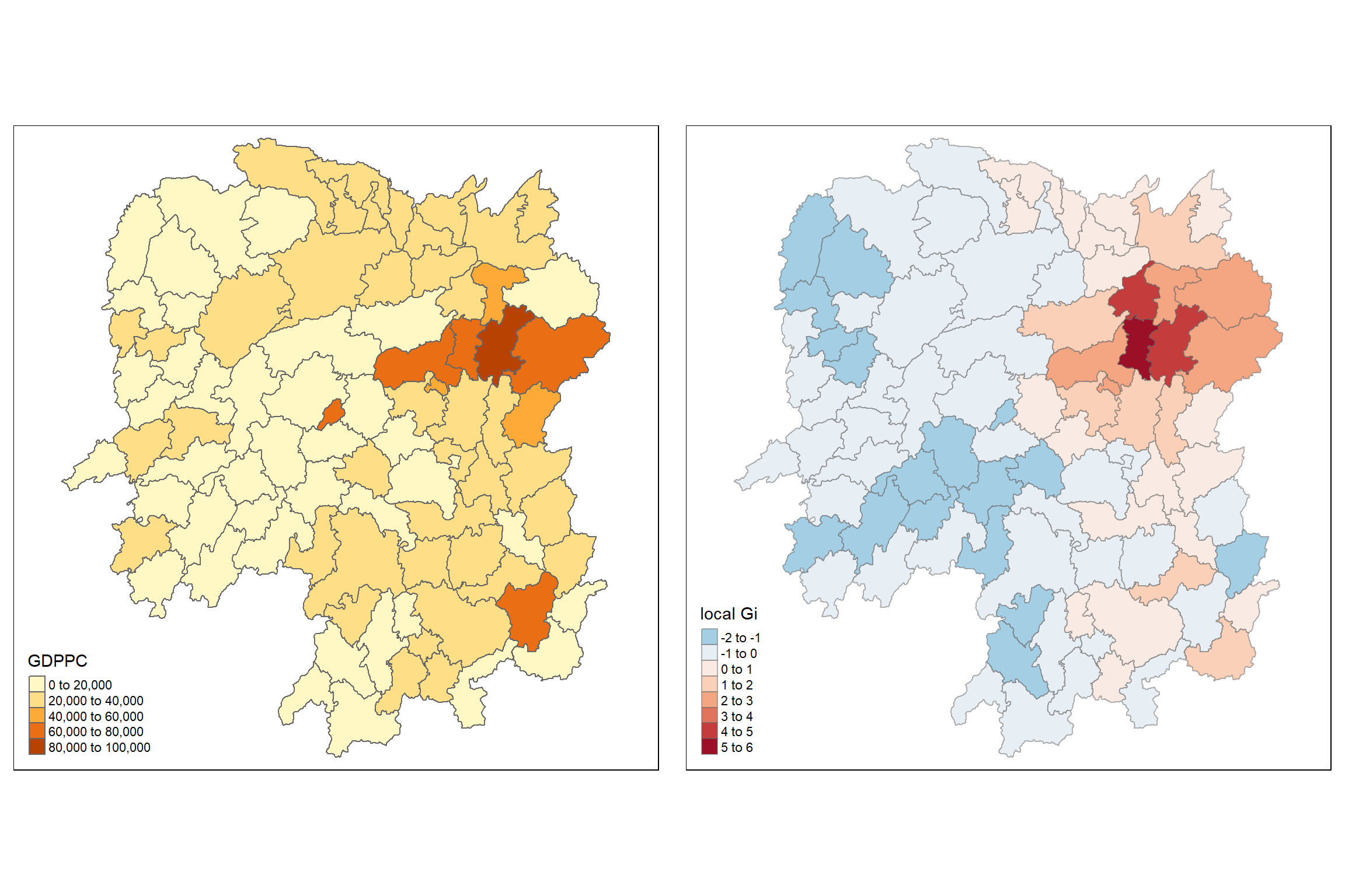
Observation
The two maps in the LISA analysis show the distribution of GDPPC and the local Gi statistics for spatial clustering:
Left Panel: GDPPC Distribution
GDPPC Range:
The regions are colored based on their GDPPC values, with darker colors representing higher GDPPC.
The central-northern region has the highest GDPPC values (dark orange), while most other regions are in the lower to middle range of GDPPC (lighter colors).
GDPPC Clusters:
- This map helps visualize which regions are wealthier relative to others, but it doesn’t provide information on the spatial clustering of these values.
Right Panel: Local Gi Statistics (Hot Spot Analysis)
Hot and Cold Spots:
The Gi statistic is used to identify “hot spots” (areas with high values surrounded by other high values) and “cold spots” (areas with low values surrounded by other low values).
The regions in dark red and dark orange in the central-northern part represent statistically significant hot spots, indicating that these regions have high GDPPC values that are spatially clustered.
Similarly, areas in blue represent cold spots, indicating regions with low GDPPC values surrounded by other low-value regions.
Significance of Clusters:
The darker the red or blue, the stronger the significance of the clustering (high Gi values for hot spots and low Gi values for cold spots).
The central region shows the strongest hot spot with a local Gi value in the range of 5 to 6, signifying a very strong clustering of high GDPPC.
Spatial Patterns:
Hot spots are concentrated mainly in the central-northern part, which matches the high GDPPC regions in the left panel.
Cold spots are scattered throughout, with notable clustering in the northwestern and southeastern parts of the map.
6.13.3 Gi statistics using adaptive distance
The code chunk below are used to compute the Gi values for GDPPC2012 by using an adaptive distance weight matrix (i.e knb_lw).
fips <- order(hunan$County)
gi.adaptive <- localG(hunan$GDPPC, knn_lw)
hunan.gi <- cbind(hunan, as.matrix(gi.adaptive)) %>%
  rename(gstat_adaptive = as.matrix.gi.adaptive.)
6.13.4 Mapping Gi values with adaptive distance weights
It is time for us to visualise the locations of hot spot and cold spot areas. The choropleth mapping functions of tmap package will be used to map the Gi values.
The code chunk below shows the functions used to map the Gi values derived using fixed distance weight matrix.
gdppc<- qtm(hunan, "GDPPC")

Gimap <- tm_shape(hunan.gi) +
  tm_fill(col = "gstat_adaptive",
          style = "pretty",
          palette="-RdBu",
          title = "local Gi") +
  tm_borders(alpha = 0.5)

tmap_arrange(gdppc,
             Gimap,
             asp=1,
             ncol=2)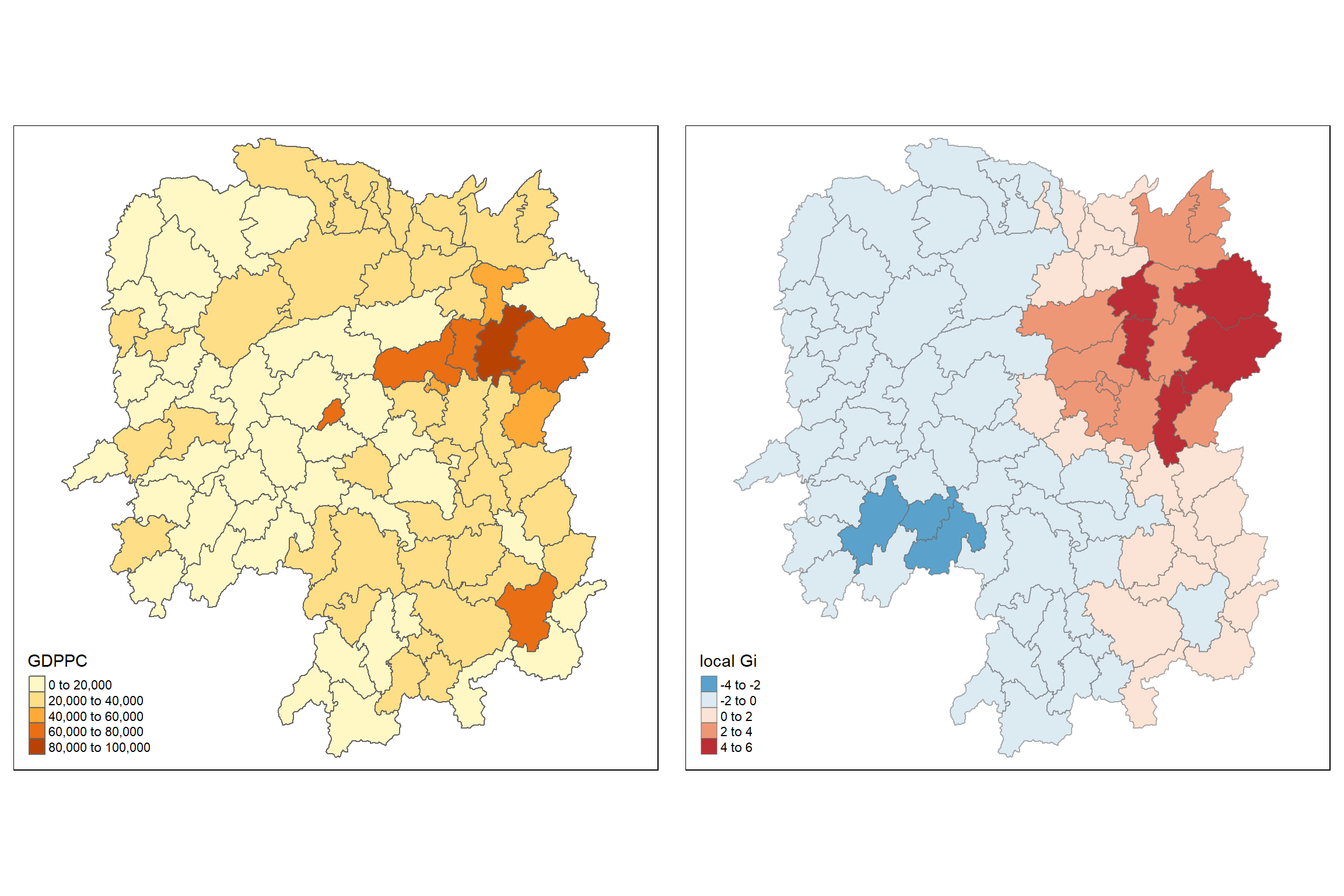
Observation
From the Gi map (right side) in your visualization, the local Gi statistic is mapped to show spatial clusters of high or low values in comparison to surrounding areas. The Gi statistic helps identify statistically significant clusters, and it is commonly used to detect local spatial autocorrelation.
Observations:
Hotspots (Red areas): The red regions in the Gi map indicate statistically significant positive spatial autocorrelation or “hotspots,” where high GDP per capita (GDPPC) values cluster together. This suggests that the areas in red (north-eastern region) have higher GDPPC and are surrounded by other high-GDPPC areas.
Coldspots (Blue areas): The blue regions represent negative spatial autocorrelation or “coldspots,” where low GDPPC values cluster together. These areas are likely experiencing lower economic activity relative to their neighbors. The most noticeable coldspot is in the southwest.
Neutral areas: The lighter shades of blue and red indicate regions with no significant spatial autocorrelation, meaning that the GDPPC in these areas does not display a strong clustering pattern relative to nearby areas.